Brand Strategy
Brand consistency: what it means and how to build the system
Consistency isn't about never changing the logo — it's whether every touchpoint tells the same story about the same brand.
A founder in Faridabad once told us their brand guidelines were "basically just the logo file and don't stretch it." That's not a guideline, it's a warning label. Consistency gets reduced to logo hygiene so often that most companies never build the actual system that keeps a brand recognisable at the shelf, on a phone screen, and inside a sales deck a distributor is reading at 11pm before a big order.
This is about what consistency really covers, what it costs a business when it's missing, and the system that makes it self-sustaining instead of dependent on one designer remembering the rules.
In short
Brand consistency is not "don't change the logo." It's whether a customer who sees your packaging, your Instagram feed, your sales deck and your website within the same week recognises them as one brand without having to think about it.
What consistency actually means beyond logo placement
Most brand audits start and end with the logo — is it the right size, the right colour, on a white background instead of stretched over a busy photo. That matters, but it's the smallest and easiest part of consistency to get right, which is exactly why so many companies stop there.
Real consistency covers five layers that reinforce each other: visual identity (logo, colour, typography, imagery style), verbal identity (tone of voice, vocabulary, how the brand describes itself), the customer experience layer (packaging unboxing, checkout flow, how a support call is answered), the sales layer (what a distributor's deck says versus what the website says), and the internal layer (how the brand is described in a job posting versus an investor deck). A brand can nail the first layer and still feel disjointed if the other four contradict it.
| Layer | What breaks it | Where it's noticed |
|---|---|---|
| Visual identity | Off-brand colours, stretched logo, inconsistent photography style | Packaging, social, website |
| Verbal identity | Formal tone on the website, casual slang on Instagram, generic copy in emails | Every written touchpoint |
| Customer experience | Premium unboxing but a scripted, indifferent support call | Post-purchase moments |
| Sales collateral | A distributor deck two design generations behind the current identity | B2B and trade meetings |
| Internal identity | A job posting that describes a completely different company than the investor deck | Hiring, culture, retention |
Consistency, properly understood, is whether all five layers tell the same story about the same brand, not whether one PDF of logo rules is being followed.
The real cost of inconsistency, layer by layer
Inconsistency rarely kills a brand outright. It taxes it slowly, in ways that are hard to put a single number on but easy to see once you look for the pattern.
Packaging and retail shelf
A range of SKUs from the same brand using three different visual systems — because each was designed in a different year by a different vendor — reads as three different, smaller companies on a shelf that already has forty competing options. A shopper scanning a Tier-2 kirana shelf for two seconds doesn't reason this through; they simply don't register the range as one brand, and the shelf-block effect that makes a bigger brand look dominant never happens.
Social and digital
A brand whose Instagram feels playful and youthful while its website reads like a formal B2B brochure forces every new visitor to re-calibrate who this company actually is. That re-calibration costs attention, and attention is the one thing a scrolling audience won't spend twice.
Sales collateral
This is the layer most founders forget to audit, because it isn't customer-facing in the obvious sense. A distributor or export buyer deciding between two suppliers is reading a PDF that was last updated two rebrands ago, with a logo the company no longer uses and pricing formatted in a way nobody in the current team would recognise. It quietly signals that the company either doesn't sweat details or isn't paying attention to its own house — neither is the impression you want in a negotiation.
Trust, compounded
Every one of these gaps is individually small. Compounded across a year of touchpoints, they add up to a brand that feels slightly unreliable without any single customer being able to say exactly why. That vague unease is expensive precisely because it's invisible in any single metric — it shows up as a marginally lower repeat-purchase rate, a marginally longer sales cycle, a marginally weaker premium a brand can charge, all at once, none individually alarming.
Inconsistency rarely loses a single sale outright. It loses a fraction of trust on every touchpoint, and those fractions compound.
Building a system: guidelines, templates, asset library, approval flow
A PDF of brand guidelines sitting in a shared drive nobody opens is not a system — it's documentation. A system is documentation plus the mechanisms that make following it easier than not following it.
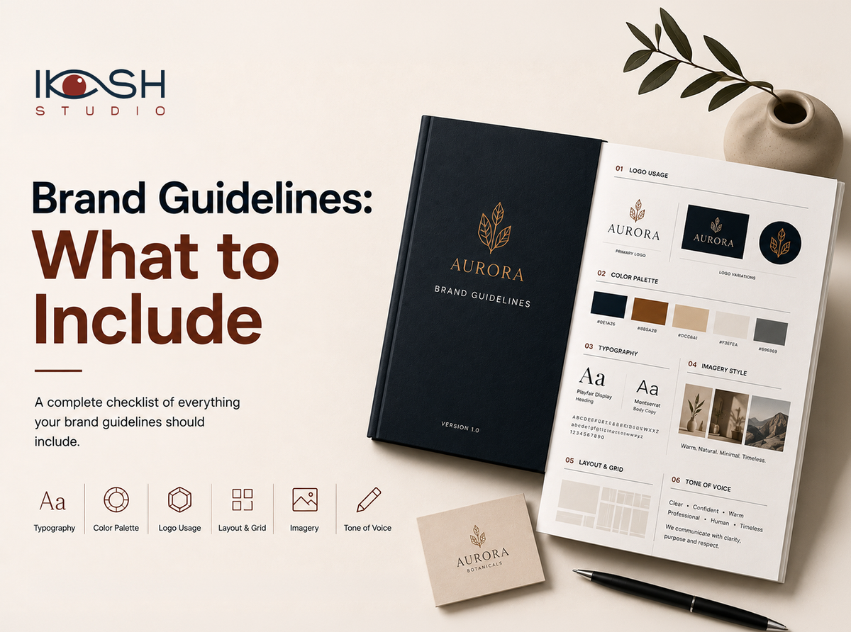
- Write guidelines that answer real questions, not abstract ones. A usable guideline document says exactly what to do when a distributor asks for a logo on a coloured background, not just "maintain clear space." See our guide to what belongs in brand guidelines for the specific sections a working document needs.
- Build templates for the formats used every week. Sales decks, social carousels, price lists, email signatures, WhatsApp catalogue images — whatever a team member reaches for weekly should already be a locked template, not a blank canvas they rebuild from memory each time.
- Centralise the asset library. One shared, current folder of approved logos, fonts, product photography and colour files, with old versions clearly archived and out of easy reach. Half of all inconsistency is simply someone finding an outdated file first because it was easier to locate.
- Set a lightweight approval flow. Not a bureaucratic sign-off chain — a single named person or small group who checks anything customer-facing before it ships, with a same-day turnaround expectation so the system doesn't become the reason people skip it.
- Review quarterly, not never. A short scan of what actually went out in the last quarter, checked against the guidelines, catches drift before it becomes the new normal.
The size of this system should match the size of the company. A five-person D2C brand needs a one-page cheat sheet and a shared folder, not a sixty-page manual nobody will read. A manufacturer selling through fifteen distributor relationships needs sales collateral templates more urgently than social media templates. Build the system your actual touchpoints require, not the one that looks impressive in a pitch.
Consistency vs staleness — they are not the same thing
The most common objection to a consistency system is that it will make the brand boring, locking a creative team into repeating the same layout forever. This confuses consistency with rigidity, and the confusion causes real damage — teams either abandon guidelines entirely or follow them so literally that every campaign looks identical to the last.
Consistency operates at the level of recognisable structure: colour palette, typography, tone of voice, the underlying grid or layout logic. Freshness operates at the level of expression within that structure: campaign themes, seasonal packaging variants, photography subjects, social content formats. A brand can run a completely different campaign concept every quarter and still be instantly recognisable, provided the underlying structure — the palette, the type, the voice — stays intact underneath the new idea.
Keep fixed
Logo usage, core colour palette, typography, tone of voice, the visual grid or composition logic.
Free to vary
Campaign concepts, seasonal packaging themes, photography subjects, social content formats, promotional messaging.
Guidelines that ban all variation eventually get ignored outright, because a team under real market pressure will break a rule that's clearly making the brand worse rather than better. A good guideline document names what's fixed and explicitly says what's open to interpretation, so a designer under deadline pressure knows exactly where they have room to move.
Should brand guidelines ever be rewritten?
Yes — at genuine inflection points like a rebrand, a new product category, or a shift in audience, similar to how a vision statement gets revisited at real milestones rather than on a fixed schedule. What shouldn't happen is quiet, undocumented drift where the guidelines say one thing and the last twenty pieces of collateral show another.
An audit checklist a founder can run in an afternoon
This doesn't require an agency or a formal audit engagement to start. Pull together the last quarter's packaging, social posts, sales deck, website screenshots and one recent customer email, and go through this list honestly.
- Do all current SKUs use the same visual system, or are older packs still running an outdated logo or palette?
- Would a customer who saw only your Instagram and only your website separately describe them as the same brand?
- Is the sales deck your team is currently using dated within the last identity update, or older?
- Does your customer support tone match the tone your marketing copy uses, or does it feel like a different company entirely?
- Is there one current, correctly labelled folder of approved logo files, or are three versions floating across different people's laptops?
- Does a job posting describe the company in language a current customer would recognise?
- Can a new team member find the brand guidelines in under two minutes, or does it require asking someone?
- Has anything shipped in the last quarter that nobody with brand oversight actually reviewed before it went out?
Three or more "no" answers is a reasonable signal that the consistency gap is costing more than a founder assumes — not catastrophically, but steadily, in the way described above.
Where to start
Run the audit checklist this week before commissioning anything new. Most companies find the gap isn't in the logo file — it's in the sales deck nobody has opened in a year, or the tone gap between support and marketing. Fixing those two is often more valuable than a full redesign. If the audit reveals a system-level gap rather than a one-off fix, that's the point where a structured brand identity engagement or a working session on creative consulting pays for itself quickly, and it's worth raising on a discovery call before the next big packaging run or trade show locks in another inconsistent version.
Our perspective
We treat branding as an investment, not a line item. Every deliverable is designed to compound trust, recognition, and pricing power over the next decade — not just look good on launch day.
— Saurabh Jain
Founder & Creative Director
Next step
Let's build your brand strategy
Positioning, narrative and identity direction before a single pixel moves. Tell us where you are today and we'll reply within 24 business hours.
No spam. No pressure. Just a strategic conversation.
Frequently asked questions.
Reader engagement
Comments(0)
Publish instantly
- Loading comments…