
Design Thinking
$10 vs $100 vs $5000 Logo — What's The Real Difference?
Three logos. Three price tags. Three completely different futures for your business. Here is what actually changes as the budget grows.
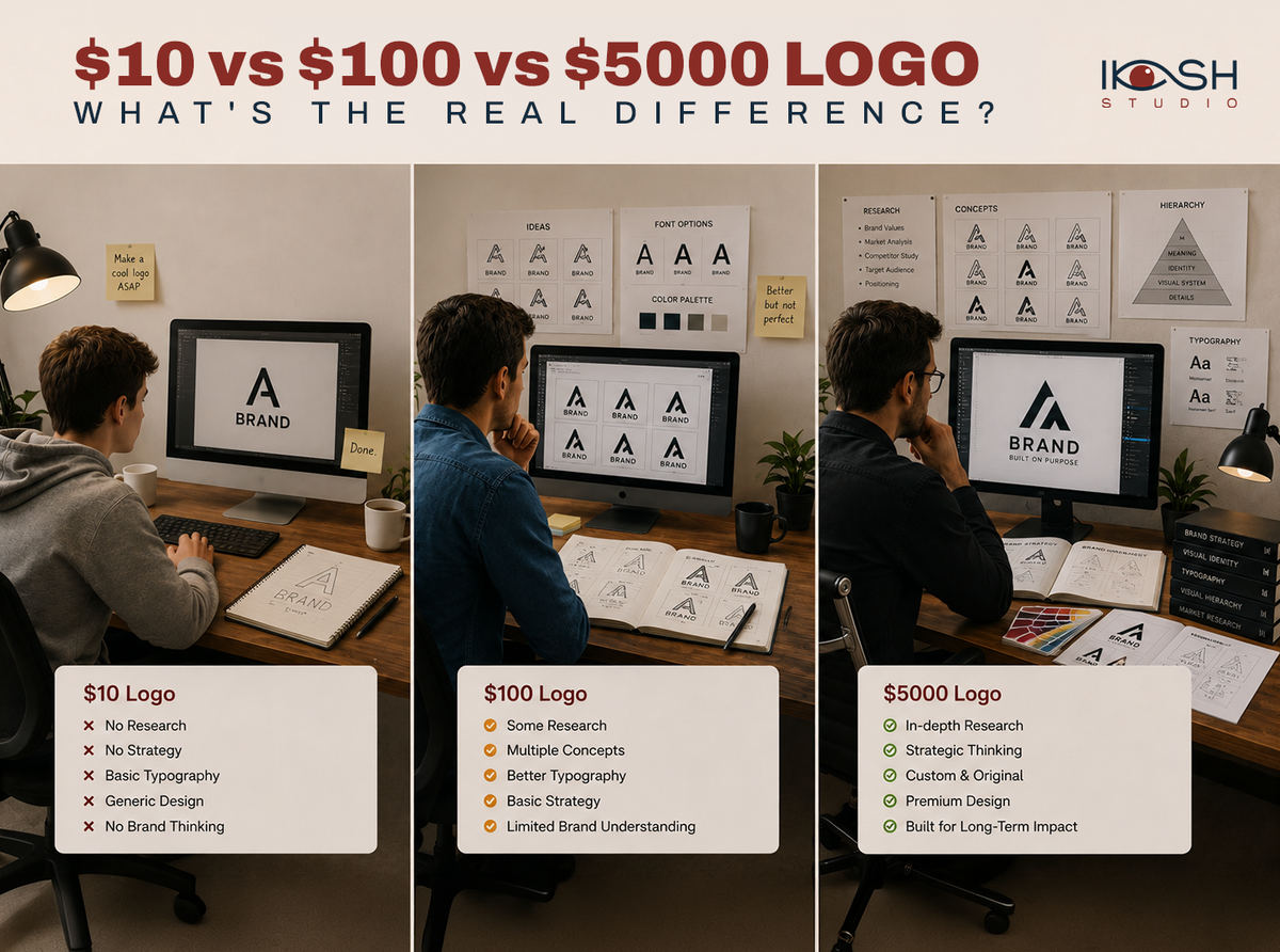
The cheapest logo and the most expensive logo can look surprisingly similar at first glance. The difference is invisible — and that is exactly why it matters.
"Why does a logo cost five thousand dollars when I can get one for ten?" It is the most common question we hear. The honest answer: you are not paying for the picture. You are paying for everything that makes the picture work.
The $10 Logo
Template-based. Generic. Fast.
- Picked from a library of pre-made marks
- No research into your audience, category, or competitors
- Likely already used by other businesses
- One file format, one color, no system around it
- Works at one size, on one background, for one moment
It is not a logo. It is a placeholder.
The $100 Logo
Semi-custom. Better thinking. Still narrow.
- A freelancer sketches a few options based on a short brief
- Some thought goes into typography and color
- You usually get a primary mark and maybe a black-and-white version
- No brand system — just the logo
It is a respectable mark. But the moment your business grows beyond a business card, it starts to crack.
The $5000+ Logo
This is where logo design stops being design and starts being strategy.
What you are actually paying for
- Research — the category, the competitors, the audience psychology, the cultural cues
- Strategy — positioning, brand archetype, voice, the words before the picture
- Concept exploration — dozens of directions sketched, killed and refined
- Typography systems — custom or carefully paired type, tested at every scale
- Grid + construction — the mark works at 16 pixels and on a billboard
- Identity system — primary mark, secondary mark, monogram, wordmark, motion variant
- Application design — packaging, social, UI, signage, merchandise
- Brand guidelines — so the system survives every designer who joins after
A logo is the tip of the iceberg. The price difference is the iceberg.
Scalability is the real test
A cheap logo works once — on a card, in a Canva post. A strategic identity works for ten years across packaging, app icons, brand films, email signatures, retail signage and partnerships. The cost-per-use of a $5000 system is far lower than the cost-per-use of a $10 logo you replace every nine months.
Perception design
Premium customers can feel a cheap logo. They cannot always articulate why, but they sense it — and they price-anchor against it. The same product priced behind a thoughtful identity sells for 2-5× more. That is not branding magic; that is perception, designed on purpose.
Where Iksh Studio comes in
We do not sell logos. We build perception-driven identity systems — strategy first, identity second, applications third, and a guideline that keeps it all coherent for a decade. Every mark we draw has to answer the question: does this make the brand more memorable, more premium and more scalable?
A logo is only the beginning.
A brand is what people remember. Start your project with Iksh Studio.
Our perspective
We treat branding as an investment, not a line item. Every deliverable is designed to compound trust, recognition, and pricing power over the next decade — not just look good on launch day.
— Saurabh Jain
Founder & Creative Director
Next step
Ready for an identity that lasts?
Identity systems built to scale across every touchpoint you'll ever need. Tell us where you are today and we'll reply within 24 business hours.
No spam. No pressure. Just a strategic conversation.
Frequently asked questions.
Reader engagement
Comments(0)
Publish instantly
- Loading comments…